Secretary of State Marco Rubio called the Biden administration’s shift to a sans serif font, to assist people with vision issues, a “wasteful” diversity move.
 https://www.washingtonpost.com/politics/2025/12/10/calibri-font-rubio-state-department
A sans serif font, Secretary of State Marco Rubio just decreed, is simply inadequate for world-class diplomacy.
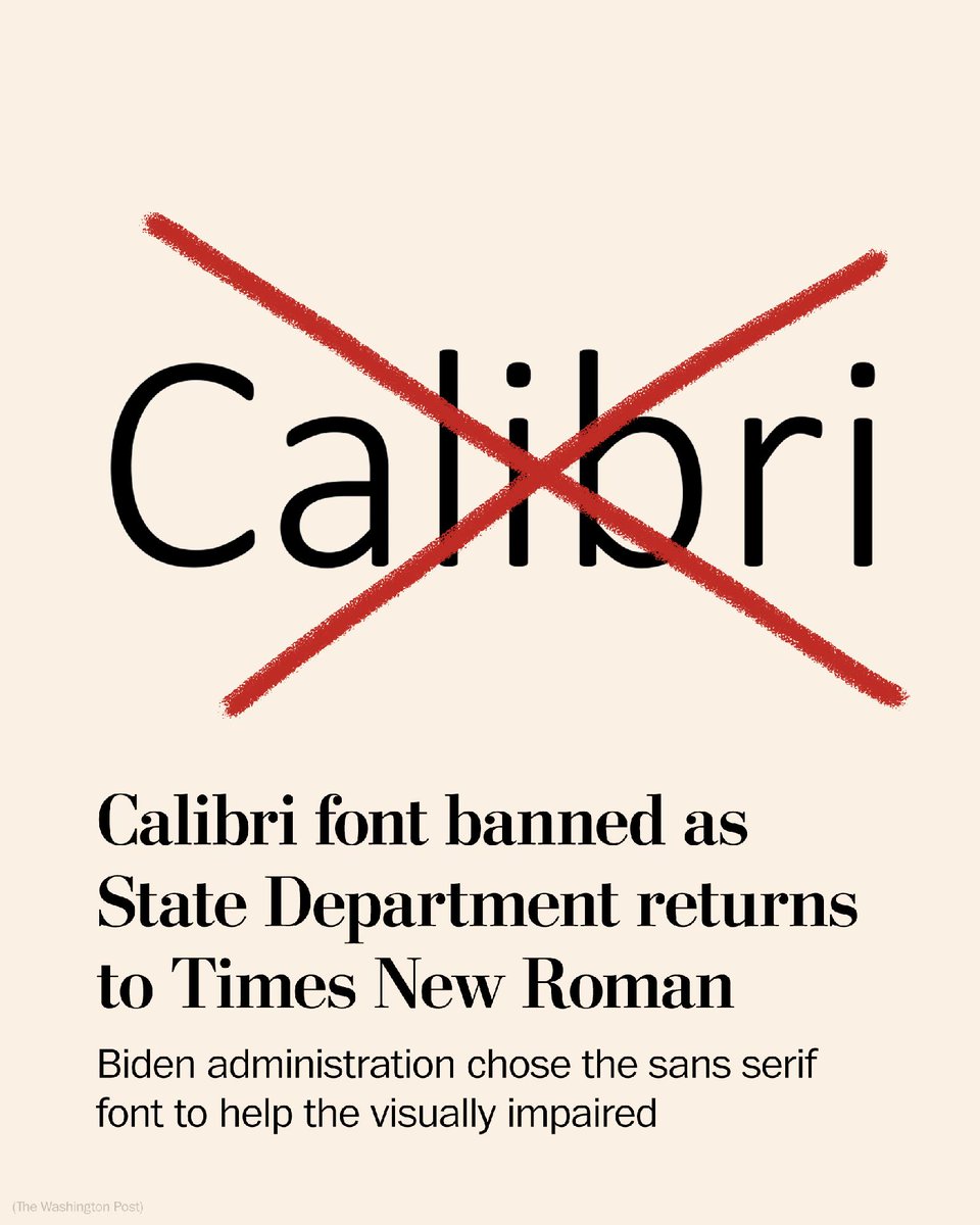
Rubio on Tuesday ordered the agency to immediately cease using the Calibri font and go back to Times New Roman in official communications, reversing another Biden administration policy intended to help employees who are visually impaired or have low-vision issues.
In a secure memo to staff with the subject line “Return to Tradition: Times New Roman 14-Point Font Required for All Department Paper,” he described the decision of predecessor Antony Blinken — directing the department to use a larger sans serif font in high-level internal documents — as a “wasteful” diversity move. Rubio labeled Times New Roman “more formal and professional.”....
The typeface shake-up is the Trump administration’s latest unraveling of Biden administration actions. Rubio — who’s currently serving as secretary of state, acting national security adviser and acting archivist of the United States — is terminating offices and initiatives created to promote and foster diversity, equity and inclusion, both in Washington and at overseas embassies and consulates. He also has ended foreign assistance funding for DEI projects abroad.....
But accessibility and vision impairment advocacy groups widely recommended and advocated for sans serif fonts, noting that those without decorative “wings” and “feet” (the small lines or strokes at the end of characters, common in serif fonts like Times New Roman) are more legible and easier to read for people with visual impairment.

 = new reply since forum marked as read